For millions of people around the world, a trip to Starbucks is more than a caffeine fix—it’s a comforting ritual, a familiar rhythm, a small moment of pause in a busy life. That white-and-green cup isn’t just a container for coffee. It’s a symbol of modern routine, carried in countless hands across cities, parks, and quiet kitchen tables.
But behind that globally recognized logo lies a detail most have never noticed. It’s subtle, intentional, and oddly human.
Let’s take a closer look at the story hiding in plain sight—one you’ve likely cradled in your hands a hundred times without ever seeing.
More Than Just a Coffee Shop
Before we uncover the mystery, it’s worth remembering where it all began.
Starbucks wasn’t born out of a corporate blueprint—it was inspired by the sea. The very name “Starbucks” is a nod to Moby-Dick, Herman Melville’s epic novel of sailors, storms, and obsession. The brand’s founders, lovers of maritime lore, wanted to capture the romanticism of the sea and the spirit of exploration.
And so, when they needed a logo, they chose a siren—an ancient, mythical sea creature known for luring sailors with song. It was an unusual choice for a coffee brand, but somehow, it fit: powerful, intriguing, unforgettable.
The first logo, created in 1971, was a brown, somewhat raw image of a two-tailed siren, bare-chested and earthy. It was bold. Iconic. But as the company evolved, so did its image.
The Transformation of the Siren
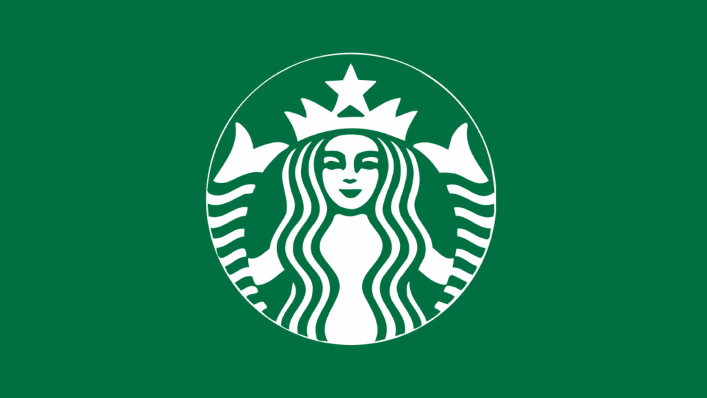
In 1987, Starbucks adopted the green color we all now associate with the brand. By 1992, the siren was redrawn to be more modern and polished, her bare chest covered, her gaze more direct. And in 2011, the biggest change came—the name disappeared.
Gone were the words “Starbucks Coffee.” What remained was only the siren herself—now center stage, crowned in green, commanding attention.
But the real story? It wasn’t about what was removed.
It was about what was quietly added.
A Closer Look at Her Face
Hold your next Starbucks cup and really look at the siren. You might notice something strange—something you’ve never registered, but once seen, can’t be unseen.
Her face, at first glance, appears perfectly symmetrical. But it’s not. Look closer:
- Her right nostril is slightly lower than the left.
- One eye is gently shadowed by the curve of her nose bridge.
- The right side of her face is a touch darker than the other.
These aren’t accidents. They’re intentional design choices. Imperfections, woven delicately into the image by artists who wanted her to feel more real.
Because here’s the truth: perfect symmetry feels unnatural. It’s cold. Robotic. Unreachable. But imperfection? That feels like us. Human. Warm. Familiar.
The designers knew this. In a digital world where everything is polished, they chose to add nuance. They gave the siren slight flaws—just enough to make her relatable. Just enough to suggest she was watching, waiting, perhaps even listening.
It’s a logo that breathes.
Why It Matters
Most people never notice these things. And yet, they feel them.
There’s a psychological comfort in the Starbucks logo, even if we don’t consciously know why. It feels approachable. Not flashy, not cold—just subtly warm, like the first sip of a well-made latte.
These design choices go beyond branding. They tap into something deeper. They remind us that beauty doesn’t have to be perfect, and that familiarity is often found in the flawed.
And maybe, just maybe, that’s why so many of us return to that cup again and again.
A Symbol of Something More
The siren isn’t just a logo. She’s a mirror, in a way.
She’s a reminder that even the most ordinary things—like a morning coffee—can carry layers of meaning. That even in a fast-moving world, someone thought to add a human touch where no one was looking.
So the next time you pick up your Starbucks drink, take a pause before your first sip. Tilt the cup. Look into her eyes.
She’s been there all along, quietly reminding you that imperfection is not something to be hidden—it’s something to be embraced.