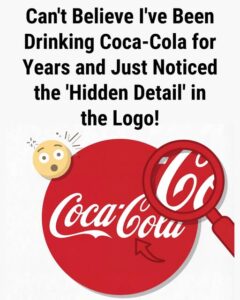
We all know the iconic Coca-Cola logo—the red-and-white script that’s as much a part of global culture as the drink itself. But recently, a curious trend has emerged: some people have begun to notice a “hidden detail” in the logo that they say resembles a smile. Once you spot it, you can’t unsee it—specifically, it’s the second “C” in the word “Coca-Cola” that some believe looks like the curve of a friendly grin. But is this intentional, or is it simply a case of creative projection? Let’s dive into the mystery behind this ‘hidden smile’ and see if there’s more to it than meets the eye.
The ‘Hidden Smile’ in the Coca-Cola Logo
The Coca-Cola logo, designed by Frank Mason Robinson in 1886, has undergone numerous iterations and updates over the years, but the most recognizable version still features the Spencerian script that was common in the late 19th century. The logo’s fluid, cursive style is elegant and timeless, and it’s this very style that some have now connected to a subtle emotional message.
The particular detail in question is the second “C” in “Coca-Cola.” If you take a close look, you’ll see that the top curve of the letter extends outward before turning under. To some, this curve resembles the shape of a smile, creating the illusion of a warm, welcoming expression. The idea is that, if the curve were tilted just a little more upward, it would unmistakably resemble a smile. So, is Coca-Cola sending an unspoken message of friendliness and joy through its logo? Or is this just another case of pattern recognition, where people see what they want to see?
What People Are Seeing: The Smiling ‘C’
Once the smile theory is brought up, it’s hard to look at the logo the same way again. The second “C” appears to be curving outward and then curling down in a way that reminds viewers of a joyful expression. For some, it feels like the logo itself is smiling at them, evoking feelings of warmth, positivity, and approachability. Many people have taken to social media to share their discovery, calling it a hidden message from the brand—a secret symbol of happiness tucked away in plain sight.
But while some see the smile as a conscious design choice, others argue that it’s simply a coincidence. Pareidolia, the psychological phenomenon where people perceive patterns (often faces) in random stimuli, could be at play here. Once someone mentions that the second “C” resembles a smile, it’s hard not to see it every time you glance at the logo. But is it really intentional, or just an unconscious leap of imagination?
A Brief History of the Coca-Cola Logo
To get to the bottom of this “smile” mystery, it’s important to understand the history behind the Coca-Cola logo. Designed by Frank Mason Robinson, the Coca-Cola wordmark has been a staple of branding for over a century. Robinson, a bookkeeper at the time, chose the Spencerian script, a popular form of cursive handwriting in the late 1800s, for its elegance and fluidity.
The goal wasn’t to create a logo that contained hidden messages or emotional cues. Instead, Robinson’s design was simply a reflection of the aesthetic conventions of the period. The swirls and curves of the letters were intended to be graceful and visually appealing—nothing more, nothing less. At the time, logos were more about brand identity and less about embedding hidden messages or subliminal cues.
The classic red background color and the iconic Dynamic Ribbon Device swoosh didn’t even come into play until much later, in 1969. So, while the second “C” might appear to evoke a smile to modern viewers, it was originally part of a design meant to convey elegance and legibility, not necessarily warmth or joy.
Was the ‘Smile’ Intentional?
Based on historical records, there is no direct evidence that the second “C” in the Coca-Cola logo was designed to resemble a smile. Coca-Cola has not released any documentation or archives confirming that the curve was meant to convey happiness. In fact, there is no mention of the smile theory in any of the early marketing materials or advertising copy from the company.
Furthermore, the idea that the second “C” was specifically crafted to evoke a smile didn’t appear until much later. The smile interpretation is a modern-day phenomenon, spurred by the current trend of searching for hidden messages in logos and branding. So, while it’s fun to speculate, we have no reason to believe that the design was intentionally meant to elicit a smile.
However, it’s worth noting that brand evolution often leads to new interpretations. As time passes and cultural contexts shift, what may have originally been a simple flourish or design feature can take on new meanings. What appeared as a stylized “C” in the late 1800s might now be interpreted as a friendly gesture—a symbol of the joy and connection that Coca-Cola has become known for.
Why the Smile Theory Feels Plausible
Even though there’s no historical evidence to suggest that the second “C” was meant to look like a smile, the interpretation feels logical for a few reasons:
1. Psychological Factors: Pareidolia at Play
Humans are naturally wired to look for patterns and faces in the world around us. This tendency, called pareidolia, is why we sometimes see faces in clouds, in the patterns of a wall, or even in everyday objects like cars or trees. It’s the same reason some people see faces in logos, and it’s why the second “C” in Coca-Cola seems to resemble a smile to many viewers. Once someone notices it, the smile interpretation becomes ingrained, and it’s hard to look at the logo any other way.
2. Alignment with Coca-Cola’s Brand Identity
Coca-Cola has long been associated with positive emotions: happiness, refreshment, and nostalgia. The brand has consistently positioned itself as a symbol of joy and connection. Therefore, it makes sense that a modern viewer might project these emotions onto the design of the logo. After all, the logo has been part of the cultural fabric for over a century, and it’s not surprising that viewers, through the lens of today’s branding culture, would perceive emotional cues in a design that is deeply embedded in the world’s consciousness.
3. Retrospective Interpretation
Logos and designs often take on new meanings as time passes. What may have been a simple flourish in the 1880s has evolved over the years into something far more significant in the 21st century. The concept of a “smiling letter” fits neatly into the modern view of branding, where logos often serve as more than just functional symbols but also emotional triggers. Thus, the smile in the second “C” may be a retrospective interpretation that speaks to the way logos can evolve in meaning over time.
Is the Smile Really There?
So, is there really a smile hidden in the Coca-Cola logo? Technically speaking, no—there’s no documentation or design brief from Coca-Cola that confirms this interpretation. But whether it was intended or not, the fact that so many people see a smile in the second “C” speaks to the power of design and the way logos can evoke emotions.
The Coca-Cola logo, in its timeless elegance, has become a visual symbol of happiness, community, and refreshment. Whether it was designed to resemble a smile or not, the fact that people project those emotions onto the logo speaks volumes about how deeply embedded the brand has become in popular culture.
The Bigger Picture: Logos as Emotional Tools
Ultimately, the Coca-Cola logo is a perfect example of how designs evolve in meaning over time. Classic logos like Coca-Cola’s are not just images—they are living symbols that take on new meanings as they pass through different generations and cultural lenses. While the smile may be a modern interpretation, it shows how design can transcend its original intent and take on a life of its own, influenced by how people feel and what they project onto it.
So, the next time you look at the Coca-Cola logo, you might see a simple, elegant script. Or, you might notice the second “C” curving outward and feel like it’s giving you a friendly smile. Either way, it’s clear that this logo, like many other iconic designs, has more power than just its visual appeal—it has the ability to evoke warmth, nostalgia, and joy, whether intentionally or not.