Starbucks is a brand that has become synonymous with our daily routines. Whether it’s grabbing a coffee on the way to work, settling in for a relaxing afternoon with a hot drink, or meeting up with friends for a caffeine boost, Starbucks has cemented its place in the hearts of millions. The familiar green siren logo is immediately recognizable, but there’s more to it than meets the eye. A closer look at the Starbucks logo reveals a fascinating detail that many people might not even notice—a hidden asymmetry that changes the way we perceive the brand’s iconic symbol. But what does this subtle design choice mean, and why is it significant? Let’s take a deep dive into the symbolism and evolution behind the Starbucks logo.
The Hidden Meaning Behind the Starbucks Logo
The Starbucks logo, featuring a siren—a mythical creature from the deep seas—has been part of the brand’s identity for decades. This enchanting figure evokes a sense of allure, mystery, and connection to the sea. The siren, with her dual nature as both a beautiful and dangerous creature, speaks to the complex relationship many have with Starbucks itself: a comforting, familiar part of daily life, yet one that also symbolizes the global reach and power of a multi-billion-dollar company.
But the significance of the logo goes beyond the choice of a siren. The siren is a nod to literature, particularly Herman Melville’s Moby-Dick. The name “Starbucks” itself is derived from the first mate of the Pequod, the ship at the center of Melville’s classic novel. By choosing this literary reference, Starbucks connects itself to a timeless story of adventure and exploration, as well as a deeper historical narrative rooted in the maritime tradition. In this way, the Starbucks logo becomes more than just a brand emblem—it represents the blending of modern culture with historical symbolism.
Symbolism of the Siren
The siren, an archetype found in Greek mythology, is traditionally depicted as a creature with a mesmerizing, enchanting presence. Her voice lures sailors to their doom, embodying both danger and seduction. In the case of Starbucks, this image is used to evoke feelings of intrigue and wonder, aligning with the brand’s ability to draw customers in with its iconic beverages and global presence. The siren serves as a metaphor for the enticing nature of the coffee experience—capturing customers’ attention with its promise of something comforting, stimulating, and even transformative.
The Asymmetry: An Unnoticed Detail
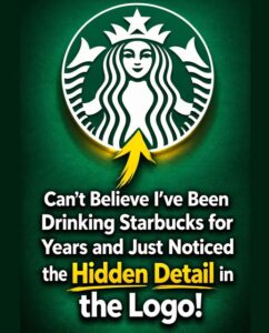
When you take a moment to closely examine the Starbucks logo, something subtle becomes apparent: the face of the siren isn’t perfectly symmetrical. While most viewers would immediately notice the siren’s allure, the finer details of her facial features are much less obvious. The right side of her face, for instance, is slightly more shadowed, and her nose dips more prominently on this side, giving her face an asymmetrical appearance.
At first glance, the siren appears flawless, but upon closer inspection, you begin to notice the imperfection. This deliberate asymmetry was not an accident but a thoughtful design choice. The team behind the Starbucks logo wanted to make the siren appear more human and approachable. In essence, the logo’s design subtly reminds customers that while Starbucks is a global powerhouse, it’s also a company that strives to remain personal and relatable. The asymmetry is a way of signaling that perfection is not always the goal—humanity and authenticity are key.
Practical Implications for Consumers and Businesses
For Starbucks, a seemingly minor design choice in their logo serves as an important branding tool. For consumers, however, this choice speaks to something much deeper. The asymmetry in the siren’s face, while a small detail, adds layers of personality and relatability to the brand, making it feel more authentic and less like a corporate giant. In a world where consumers increasingly demand transparency and authenticity from businesses, this small adjustment serves as a visual cue that the company values individuality and imperfection.
For businesses, paying attention to such details can have significant implications. Often, it’s the subtle elements that set brands apart from their competitors. The success of Starbucks is partly due to its attention to design, symbolism, and consumer perception. By embedding deeper meaning into its logo, Starbucks creates a more personal connection with its customers—something that keeps them coming back, time and again.
Building a Brand Identity Through Details
The Starbucks logo isn’t just a coffee cup symbol; it’s a carefully constructed representation of the company’s ethos. The use of the siren invokes feelings of both familiarity and mystery, inviting customers to delve deeper into the brand experience. Additionally, the subtle asymmetry in the logo humanizes the brand, making it feel more genuine and approachable.
For businesses aiming to cultivate a strong brand identity, focusing on the smallest details can pay off in meaningful ways. The seemingly insignificant design choices—like the tilt of the siren’s face—are the things that make a logo memorable and enduring. Brands that understand this principle are more likely to connect with their target audience on a deeper level, resulting in stronger brand loyalty and recognition.
Impacts on Consumer Behavior
For consumers, the subtle aspects of branding can influence purchasing decisions, even if those details are unconscious. In Starbucks’ case, the siren’s asymmetry makes the logo feel more human and less commercial. This small but effective design choice taps into consumers’ emotional connection to the brand. It’s an example of how aesthetics can shape consumer behavior by influencing perceptions of a brand’s values and its authenticity.
Moreover, the siren logo functions as a form of silent communication, signaling to consumers that Starbucks is a brand that values creativity, artistry, and attention to detail. This encourages customers to see the brand not just as a coffee company, but as part of a larger cultural movement—one that is mindful of its design, history, and emotional resonance with its audience.
Historical and Cultural Context of Starbucks’ Logo
The evolution of the Starbucks logo is rooted in both American history and global culture. The company, founded in 1971 in Seattle, Washington, initially embraced the imagery of a classic, full-bodied mermaid. Over time, however, the logo underwent several transformations, reflecting the company’s changing identity and growth.
The Early Years: A Nod to Seattle’s Maritime History
When Starbucks first opened its doors, the logo was heavily influenced by the city’s maritime history. Seattle, known for its connection to the sea and its bustling port, was the perfect backdrop for a company seeking to draw inspiration from the ocean. The early Starbucks logo featured a detailed, two-tailed mermaid with a crown, representing the mystical, enchanting qualities of the sea. The mermaid’s image tied Starbucks to Seattle’s maritime culture and helped convey the idea of exploration and adventure, much like the sailors in Moby-Dick.
The Green Evolution: A Symbol of Sustainability
As Starbucks grew into a global brand, it also evolved its logo to reflect changing cultural values. In 1987, the logo transitioned to the now-iconic green color, signaling a shift towards environmental sustainability and a more modern, sophisticated image. The color green was chosen to evoke feelings of growth, renewal, and harmony with nature—values that resonate with the growing focus on environmental issues and corporate responsibility.
By adopting green as the dominant color, Starbucks aligned itself with the rising interest in sustainability, which would go on to play a significant role in the company’s corporate strategy. Green became synonymous with Starbucks, representing the brand’s commitment to ethical sourcing, environmental stewardship, and community engagement.
The 2011 Redesign: Simplification and Modernity
The biggest change to the Starbucks logo came in 2011, when the company made the bold decision to remove the words “Starbucks Coffee” from the logo entirely. This shift marked a move toward simplification, making the siren the central focus. By removing the text, Starbucks created a more universally recognizable symbol that could be easily understood across different languages and cultures. This decision reflected the company’s evolution from a regional coffee chain to a global cultural phenomenon.
The simplified logo also allowed Starbucks to position itself as more than just a coffee company—it was now a lifestyle brand, one that could exist in any context, whether on a coffee cup, a tote bag, or a social media post.
Tips and Insights for Starbucks Enthusiasts and Brand Fans
For those who appreciate the finer details of design, there are several insights and takeaways from the Starbucks logo that are worth considering:
1. Look Beyond the Surface
The asymmetry in the Starbucks logo is a reminder to look beyond the obvious. Much like the siren herself, the true beauty of the logo is in its imperfections and the story they tell. Next time you find yourself holding a cup of Starbucks, take a moment to really examine the logo. You might be surprised by the layers of meaning you uncover.
2. Pay Attention to Branding Choices
Starbucks’ logo evolution is a prime example of how a brand can use design to communicate values, cultural shifts, and consumer sentiments. By observing how logos evolve over time, businesses can learn valuable lessons about brand identity, customer engagement, and the power of visual storytelling.
3. Appreciate the Subtle Details
Small details often make the biggest impact. In the case of Starbucks, the logo’s design is a great example of how tiny adjustments—like the tilt of the siren’s face—can create a deeper emotional connection with consumers. It’s a reminder that the success of a brand is often built on its ability to create meaningful, human experiences through design.
Conclusion
The Starbucks logo is more than just a symbol of a coffee company; it’s a carefully crafted piece of branding that represents adventure, exploration, and authenticity. The hidden asymmetry in the logo adds a layer of humanity to the brand, making it feel more personal and relatable to consumers. As Starbucks continues to evolve, the small details in its logo remind us that even the most recognizable