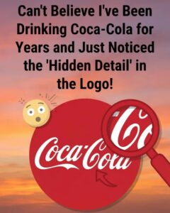
It often begins with a casual observation. Someone mentions it in passing, and suddenly a familiar logo looks different forever. What once appeared as a simple curve in lettering now resembles a subtle smile, softening the design and giving it a hint of personality. After that moment, it becomes nearly impossible to separate the image from the feeling. The shape feels inviting, almost friendly, as if the product itself were offering a quiet greeting. Whether intentional or accidental, this small visual shift shows how easily perception can reshape something we thought we fully understood.
The script-style logo itself has existed for well over a century, created during a time when elegance and flowing handwriting were common in branding. Historical records suggest the design was chosen for readability and visual appeal, not to convey emotion or symbolism. There is no documented evidence that the curves were meant to represent a face or expression. At the time, the goal was refinement and consistency, not psychological messaging. Yet as decades passed, the lettering remained while the way people interacted with the brand—and with advertising in general—changed dramatically.
What transforms a simple curve into a smile is not design alone, but the human mind. People are naturally inclined to recognize faces and emotions, even where none were intended. This tendency, often described in psychology, helps explain why we see animals in clouds or expressions in everyday objects. Over time, repeated exposure to positive associations—family gatherings, celebrations, shared routines—strengthens the emotional response tied to a familiar symbol. The mind begins to project warmth back onto the shape itself, turning neutral design into something that feels personal and reassuring.
In this way, long-lasting symbols take on a second life beyond their original purpose. On paper, they remain unchanged: ink, curves, and spacing. In experience, they become emotional touchpoints shaped by memory and context. The perceived smile is not simply a clever trick of branding, nor is it an illusion to be dismissed. It reflects something deeply human—the desire to find comfort, familiarity, and friendliness in the world around us. Sometimes, even a letter can feel welcoming, not because it was designed that way, but because we are wired to look for signs that we belong.